Below are my development drafts for front covers. I have asked four pupils to look at my work and evaluate the positives and negatives of it that can be edited to make my work a success.
1st Draft
1st Draft
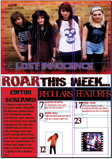
Harry: The use of an editors message is effective as it introduces the magazine and makes it personal for the reader. Things I would change on your contents page are the image of ryan screaming as it has been used on the front page, I would also change the type face for 'regulars' and 'features' as youhave mixed serif and san serif which I think makes the page look messy and confusing. I would also reduce the size of your page numbers as it is preventing alot of text from being added.
Shannon:I think it is good how you have used a key landscape image within your contents page as it implies that this is what the double page spread will be about. Things that need addressing are a page number is needed on your key image and should stand out to show importance, another thing I would change is the amount of text in the editors message as it is preventing more coverlines being added.
Kieran:It is clever how the title is 'editor screams' as it matches the genre of metal/rock. I think it is also effective how you have placed an image into a photo reel to act as a border. If I was to change two things it would be that a page name is needed for the key image that describes what the page is about, I would also add a fill colour to the masthead 'ROAR THIS WEEK'
Rachel: It is effective how you haven't used the word 'contents' as it makes the cpntents page different to others therefore would stand out. The red glow around the key image is also clever as it matches the colour scheme and makes it look attractive. Things that need editing are the amount of page titles there are, I would also make a different colour to differentiate page name and discription.
2nd Draft

Harry:Changing the font style on 'Regulars' and 'features' helps to match the genre more. Effectivley more pages have been added making it look more professional and realistic. Things that need editing are the placing of the text 'lost innocence' and 'school sucks' they need to be center in my opinion, finally the advertisement to 'win oli sykes' clothes' needs to be edited as there is a white background to it covering some of the text.
Shannon:Adding black against 'ROAR THIS WEEK' helps to match the colour scheme and makes the text stand out. Two things I would change are the chance to win oli sykes' clothes element as if you have more images, you should always put them in. I would also change the placing of the text next to the image, as it changes from left to right of the images, consistency is needed.
Kieran:The use of using two colours on the page numbers is effective as it matches the colour scheme. It is also clever how the number on the key image is large just like the image.Things that need addressing are the amount of pages there are, there needs to be atleast 10 to make it look professional. Another thing that needs changing is the text 'ryan osbourne takes the scream test' as the spacing between the letters seem to be larger than the others.
Rachel:It is effective how there is a difference in colour with the page names and discription as it helps to differentiate them and matches the colour scheme. If I were to edit two things, it would be the placing of the numbers as they are not in line with eacother underneath. The black squares that 'Features' is typed in is not inline with 'Regulars' this needs to be addressed to make it neat.
Draft 3

Here are the comments for my 3rd development draft.
Harry:The use of placing an image instead of the competition is effective as it adds more media to it however the image is half cut off and needs editing. The images need to be smaller so that more pages can be added. Something needs to be placed between 'regulars' and 'features' so it doesnt look like one sentence.
Shannon:It is effective how some of the images contain action as it will attract an audience and makes the page more appealing. Many more page names are needed and the page numbers need to be much smaller. Adding to this the editors box could be made thinner, giving more space for text.
Kieran: It is effective how the word 'ROAR' has used the exact same colour as the masthead, I commonly see this within magazines. Something that need addressing are the placing of the band name and page name, I think it would be better if they were the other way round, band name on top. I also feel as if this type face could be changed to matched the genre of metal/rock.
Rachel:It is effective how real footage has been used for your contents page as it will attract an audience. What needs to be addressed is the amount of space taken up by the 'roar this week' and 'regulars' and 'features' I think it could be reduced making more space for text.
Rachel:It is effective how real footage has been used for your contents page as it will attract an audience. What needs to be addressed is the amount of space taken up by the 'roar this week' and 'regulars' and 'features' I think it could be reduced making more space for text.
No comments:
Post a Comment