Thursday 8 November 2012

Final Product


Question 1. How does your media product use, develop or challenge forms and conventions of real media products?

Below are analyses of my final product, I have circled certain elements on the existing products that I have followed and developed onto my final product. The colour of each circle matches each piece of text.


Question 2.How does your media product represent particular social groups?

Below is a Prezi, displaying my front cover, Contents page and double page spread I have created. I have annotated it discribing how each element helps to reflect the emo/grunge/rock social group.

http://prezi.com/lv8vovvhturq/how-does-your-media-product-represent-particular-social-groups/

Question 3.What Kind Of Institution Would Distribute Your Product?


My magazine is a music theme with the particular genre of metal rock. The particular distribution that might distribute my magazine are supermarkets and local corner shops. Particularly corner shops as they sell a wide variety of magazines of all genres and due to it being peoples local corner shop it means that a different variety of people would go into the shop and if someone was going to buy a magazine they wouldn’t walk all the way to a supermarket just for that.

However supermarkets such as asda, Sainsbury’s etc might distribute it as they are well known and trusted companies whom have a magazine section. Due to the shop being bigger it means more people go there and would see the magazine,adding to this point if more people go there will be a greater income. Shops such as waterstones and whsmiths might
distribute my magazine as they are well known and trusted companies. Along with this the main content in the store is book and stationary and magazines come under this genre. Although the magazine is not free it is £2.50 which will bring in an income for the shop as well as the magazine company.
 
When considering the fact that it is a music magazine it may be sold in music shops as it matches the genre. People in a music stores preferably enjoy music and if the mode of address and genre matches there taste then they would be more likely to buy it. A particular place my magazine may be distributed is Camden as it is known for its punk rock scene and has many music stores and punk clothing stores. Therefore my magazine can be distributed into one of these shops in Camden as the social groups in Camden would match the genre of my magazine therefore they are more likely to be interested. Gigs are a good place for my magazine to be distributed for if its a rock gig then everyone there would be interested in rock music therefore the magazine would match their taste. Aswell as this, in my magazine there are images of bands playing at gigs so the audience at the particular rock gig that my magazine is being distributed at might want to see an insight into what other bands are like live.

I have researched into what company I personally thought would distribute my magazine, through this research I came across, BAUER, a multinational media company headquartered in Germany which operates in 15 countries worldwide. Bauer magazine publish and distribute Kerrang and Q magazine, two very popular rock magazines. Due to the fact that these two magazines share the same genre I feel as this company would be perfect for my magazine. KerranG and Q are very successful magazines that have made it worldwide therefore, Bauer have the ability to do the same to ROAR magazine, bringing in a great profit and a large fan base.
Click HERE forthe link to BAUER official website


Question 4-Who would be the audience for your media product?

Below is a video describing the social group audience for my media product:

 If the video fails to play please click HERE


Above is what a female who would reads my magazine is most likely to look like.

When considering the audience for my media product, its not just about the social groups its about the gender and the age. I personally feel that the target age is those 15-35, one reason for this is because of the mode of adress, some swear words occur within the article, these words would not be approprate for a younger audience however those 15-35 are most likely to swear. The content of the story is not acceptable fr those younger than 15, this is because it implies that school sucks and you should drop out, although those 15-16 are still in compulsory school soon they will longer be. Another reason or this to be the age target is because those younger would not be aware of the music and the language and topics in the songs can be unacceptable for them. Along with this they would not yet have found there style as they are still growing up. The age of the artists in the images range from 15-28 which implies that the age target is 15+ however it is still available for those below 15 to read it.

The gender that my magazine is aimed at is both male and female as the genre metal/rock is a mixed genre. The images display both male and female therefore catering to both. However there are more images of females than males, some would say that this magazine is more aimed at girs because of this but this is an example of gaze theory, four attractive girls would bring in a male audience. The colours used are red,black and yellow all three colours that can be associated with both male and female. The story itself is aimed at both genders at talks about issues at school and their experiences at school, things that both male and female can relate to.

Question 5. How did you attract/adress your audience?

Below is a video of a student analysing my work, discribing what attracted him to my Front Page, Contents Page and Double Page Spread.


.
If the video fails to play please click HERE
I have supplied a wordle containing words that Harry mentioned in the video to discribe my product and words that other members of my class used to discribe them. Along with this I have explained how  I have addressed my audience, this is through the use of gaze theory, typography,graphication etc.

Front Cover


I addressed the age target for my front cover by including images that vary in age from 16-28, although the target ages is 15-35, these images would still appeal to them.I have adressed the gender through the use of colours, red black and yellow, all three colours cater to both male and female therefore not aiming at any sex inparticular. I have adressed the social groups through the use of mise-en-scene, the social groups for my product are emos/grunger/rockers. I have adressed this through the mis-en-scene as all five of the images show the artists with big fringes a common style found on these particular member of the social groups. Along with this dark mysterious colours have been used as it is stereotyped with the emo genre however they are known to wear clothes that completley contrast and I have done this through the colour. Effectivley the use of contrasting colours helps them to stand out against eachother especially on a black background . The masthead effectiveley addresses the social groups as its bold, loud and dominating, similar to the music which would attract an audience.


Contents Page


I addressed the age target of the audience through the use of 'signing up to roar' as when you turn 15/16 you tend to do things by yourself and have more access to a computer. I have also adressed the age audience by including a page name about the 'roar tour,' the age limit to go to concerts without an adult is generally 16 therefore it fits in with age target. Following this I have adressed the gender through the genre itself as it is a genre that aims at both male and female eventhough you are more likely to see male metal artists. I have also adressed the gender once again through the colour scheme and by having male and female iconic artists. I have adressed the social group of emo/grunge/rockers through one of the page discriptions 'is josh franceschi still your lover boy,' only those in these particular social groups would get this sentence as they would have listened to you me at six's song. Another way I have adressed the social group is through the use of drums in one of the images, as people in these social groups tend to be in bands that are loud and heavy, the drums help to reflect that.Once again I have adressed the social groups through the mise-en-scene on the key image, one of the tops has a skull on it, a common graphic stereotyped with these social groups, aswell as this I have adressed the social group through the 'school sucks' header as it is rebelious just like these social groups are stereotyped to be therefore it would apeal to them.


Double Page Spread


I have adressed the age target through the language, some foul language has been used such as 'fuck' and 'shitty,' this is language that those 15-35 would be speaking. The language is coloquial as it is coming from artists who I've made to be 18 speaking about there past problems, the use of coloquial language adresses this age target as it is how the current generation tends to be speak. I have clearly adressed the gender on my contents page through the story as it is issues that both males and females sometimes face. The use of having four girls as the images can show the mix of genre for it adresses a female audience and gaze theory would work here therefore adressing a male audience that would be attracted by them. The social groups, emos/grungers/rockers have been adressed through the rock hand graphics, particular hand gesture they tent to make. Along with this I have adressed these social groups through the mode of adress as there are harsh swear words, this language tends to be used by those in these social groups as they are loud and dominating. Finally I have adressed these social groups by adding 'we were't born for school, we were born to rock' the word rock itself adresses them and their rebellious stereotype of loving music and only music.

Question 6.What have you learnt about technologies from the process of constructing this product?

AS Media was the first time I had ever done media as I did not chose it for GCSE. Along with this I also came into year 12 media later than others. During my preliminary task I felt that I had no knowledge of how to use the softwares, indesign, photoshop and illustrator. On my preliminary front cover and contents page it is clear that my I lacked in knowledge as I stretched the front cover key image and made it the background image, this was a major fault on my work. On the contents page it is clear that I was not confident as the images had a lack of editing and the angles they are taken were wrong. However when doing the final product, I realised that my knowledge of these softwares had grown and i was much more confident, this is clear throuh the use of edited images, changing colours of the photo reel and placing images into a polaroid(merging them together.)


Adobe Photoshop
Below is a video tutorial on how to change the colour of an item of clothing, I used this tutorial to help me change the colour of the photoreel as it was previously black but I changed it to red to match the colour scheme. 


My knowledge of photoshop has grown since the preliminary task I have learnt three particular things;
How to Merge two things together, I used this by merging the polaroid and the image inside it together.

How to completley change the colour of something, I did this previous times on the wire, photoreel and the graphic rock hands.

How to contrast and saturate an image, I used this various times on my images, especially the one of ryan screaming as it turned red to match anger and the colour scheme.

Example of What I've Learnt in Photoshop;


Adobe IndesignBelow is a video tutorial on how to use the eyedropper tool. I used this within my work when I had all different text colour and was finding it hard to get all the colours the same.


My knowledge of InDesign has grown durastically from my preliminary task, I have learnt thre particular things;

How to add effects to the text, I chose to use the shadow effect on the text on the footer.

How to rotate images, althought this would be classed as a simple task, did not know how to do it. The use of the rotate tool has been used on my key image on the front cover, photo reel and the masthead on the double page spread.

How to change the height and width of the spacing of the text, I have used this on my front cover with the coverlines on top of the photoreel images.


Example Of What I've Learnt In InDesign


Adobe Illustrator
Below is a video tutorial on how to use the star tool, I especially used this tutorial to find out how to add more legs to the my star in which I used to make the page look exciting and its an effective shape to add text into.


I did not use Illustrator  in my preliminary task so this was my first time, I only used it once and this was to create a star. What I did to my star on Illustrator is add more legs to it as their were previously 5. I also added a line colour, and changed the width of it, it was black and I changed it to red. I also added a fill colour to it and a show, I chosen yellow as it matched my colour scheme.


Example Of What I've Learnt In Illustrator


Green Screen

For my final product I used a Green Screen, I had not used this before. The green screen is effective as it contrasts against all colours on the image you take a picture of so you can cut out the green with the magic wand tool easily. When using the green screen we had to use the lights, they had to be positioned so that the clarity of the images were clear.


Question 7.Looking back at your preliminary task, what do you feel you have learnt in the progression from it to the full product?

Below is a video I created on adobe premiere pro explaining what I have learnt, overcome, like and dislike about my product, what I would change and what I have incorporated that is similar to my preliminary task.


If the video fails to play please click HERE


Chosen Photography

Below is a link to a prezi I created showing the images I used within my front cover, contents page and double page spread. I have explained why I chose the particular image and what I like about them.

http://prezi.com/g9bvlonswajl/edit/#0_4692735

Original Photography

Below are thumbnails of all the photography I have taken. The settings of these photographs are infront of the green screen, at an avril lavigne concert, at a young guns concert, infront of the school garage, behind the school railings, in the school classroom, behind the buildings and in the corridor.

Double Page Spread Development Drafts

Below are my drafts for double spread pages, I have asked four students to analyse them giving me pros and cons so I can edit them making them perfect.


Draft 1


Harry:The use of a diagonal masthead is effective as it is different and stands out. If I were to change anything it would be the mix of colours on the text and the outline on the text aswell, you should stick to 1 or two single colours otherwise it will look messy and chaotic.

Shannon: Having a large quote in the middle of the article is effective as it is a common code and convention within magazines. However I feel that the second half of the page with the images needs somethingelse to brighten it up.

Kieran:Your introduction paragraph is really good and upbeat, it introduces the reader into what the article is going to be about. More text is clearly needed for the article to be complete, along with this I think that the two portrait images should be next to eachother and the landscape images adjacent to eachother to make it look neater.

Rachel:The use of having your image in polaroids makes the page attractive and different, it's my favourite part of your double page spread. There needs to be a differrent colour for the question and answer so you can differentiate the two.

Draft 2


This is my second development double page spread draft.


Harry: The drop cap is effective as it looks like a real article. The use of red crosses are good as it could imply that they're dangerous. Hyphernates need to be removed as they aren't ever seen in magazines therefore your work will look unprofessional.

Shannon:The consistent colour match of red and black is effective as it has been used through out the front cover and contents. The letters of each of the band members within the article need to stand out, be bolder and larger so they dont blend in with the answers.

Kieran: Changing the font on the title to the same as on the contents page created consistency and matches the genre better.Make sure that the text is kept within the margains as part of the masthead has been cut off, this needs to be addressed.

Rachel: Moving the title onto the second half of the double page spread is effective as it creates layering and fills up dead space. A peice of furniture that is vitaly needed is page numbers as they are a common code and convention within magazines.

black and red

Contents Developmentd Drafts

Below are my development drafts for front covers. I have asked four pupils to look at my work and evaluate the positives and negatives of it that can be edited to make my work a success.


1st Draft


Harry: The use of an editors message is effective as it introduces the magazine and makes it personal for the reader. Things I would change on your contents page are the image of ryan screaming as it has been used on the front page, I would also change the type face for 'regulars' and 'features' as youhave mixed serif and san serif which I think makes the page look messy and confusing. I would also reduce the size of your page numbers as it is preventing alot of text from being added.

Shannon:I think it is good how you have used a key landscape image within your contents page as it implies that this is what the double page spread will be about. Things that need addressing are a page number is needed on your key image and should stand out to show importance, another thing I would change is the amount of text in the editors message as it is preventing more coverlines being added.

Kieran:It is clever how the title is 'editor screams' as it matches the genre of metal/rock. I think it is also effective how you have placed an image into a photo reel to act as a border. If I was to change two things it would be that a page name is needed for the key image that describes what the page is about, I would also add a fill colour to the masthead 'ROAR THIS WEEK'

Rachel: It is effective how you haven't used the word 'contents' as it makes the cpntents page different to others therefore would stand out. The red glow around the key image is also clever as it matches the colour scheme and makes it look attractive. Things that need editing are the amount of page titles there are, I would also make a different colour to differentiate page name and discription.


2nd Draft


These are the comments for my second development draft.


Harry:Changing the font style on 'Regulars' and 'features' helps to match the genre more. Effectivley more pages have been added making it look more professional and realistic. Things that need editing are the placing of the text 'lost innocence' and 'school sucks' they need to be center in my opinion, finally the advertisement to 'win oli sykes' clothes' needs to be edited as there is a white background to it covering some of the text.

Shannon:Adding black against 'ROAR THIS WEEK' helps to match the colour scheme and makes the text stand out. Two things I would change are the chance to win oli sykes' clothes element as if you have more images, you should always put them in. I would also change the placing of the text next to the image, as it changes from left to right of the images, consistency is needed.

Kieran:The use of using two colours on the page numbers is effective as it matches the colour scheme. It is also clever how the number on the key image is large just like the image.Things that need addressing are the amount of pages there are, there needs to be atleast 10 to make it look professional. Another thing that needs changing is the text 'ryan osbourne takes the scream test' as the spacing between the letters seem to be larger than the others.

Rachel:It is effective how there is a difference in colour with the page names and discription as it helps to differentiate them and matches the colour scheme. If I were to edit two things, it would be the placing of the numbers as they are not in line with eacother underneath. The black squares that 'Features' is typed in is not inline with 'Regulars' this needs to be addressed to make it neat.


Draft 3


Here are the comments for my 3rd development draft.

Harry:The use of placing an image instead of the competition is effective as it adds more media to it however the image is half cut off and needs editing. The images need to be smaller so that more pages can be added. Something needs to be placed between 'regulars' and 'features' so it doesnt look like one sentence.

Shannon:It is effective how some of the images contain action as it will attract an audience and makes the page more appealing. Many more page names are needed and the page numbers need to be much smaller. Adding to this the editors box could be made thinner, giving more space for text.

Kieran: It is effective how the word 'ROAR' has used the exact same colour as the masthead, I commonly see this within magazines. Something that need addressing are the placing of the band name and page name, I think it would be better if they were the other way round, band name on top. I also feel as if this type face could be changed to matched the genre of metal/rock.

Rachel:It is effective how real footage has been used for your contents page as it will attract an audience. What needs to be addressed is the amount of space taken up by the 'roar this week' and 'regulars' and 'features' I think it could be reduced making more space for text.

Front Cover Development Drafts

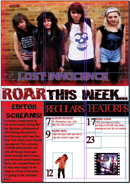
This is my first development draft for my front cover. I  asked four of my fellow pupils to comment on the page with pros and cons, plus some constructive criticism that I can take into account and edit.


1st Draft

Harry:The key image is very effective, Melissa is making eye contact which makes it personal with reader. Adding to this there is clear iconography that she is in a rock band with the use of an electric guitar and mise-en-scene with the long fringe and dark clothing. However if I was to edit anything on your front cover it would be the photo reel, for the second image down, there needs to be some form of background within this image in order for it to match with the above image. Another thing that is needed, is an issue number and date, this particular furniture is vital as it's a common code and convention for magazines.

Shannon: Having a footer helps to add more stories to the front cover yet more effectivley and smaller, the use of rock hands to seperate each band name is effective as it matches the genre. Within the polaroid there needs to be coverlines to explain what each image is about therefore the reader would know whether that page is to their preferred reading.

Kieran: I personally think that the font 'hulkbusters' used for the masthead fits in perfectley with your theme of metal/rock as its bold and overpowering just like the music. I also like the colour scheme of red and black, two colours that also reflect the genre. However one piece of criticism is that the image of ryan screaming has been used twice in your work, meaning that there is not enough variety within your images. A vital piece of furniture that needs to be included is a bar code and price, these will help fill up dead space and will make the magazine look professional.

Rachel: The use of real footage is effective as it will engage the reader, adding to this it shows action which will attract an audience as it will remind them of previous concerts they've been too. If I was to change any thing it would be the heading, it needs to be much larger. Another thing I would include is fun, something that lures an audience in either posters or a competition.


2nd Draft


This is my second development draft for my front cover.

Harry: Having a poster section is very effective as it is attractive and fun, it is good that you have made the words 'free' and '2' in bold as they are what would lure an audience in. Some constructive criticism within this front page is that the title layer over the key images head, layering is effective but the key image is the main highlight of the page. I would also reduce the size of the bar code as it looks unprofessional.

Shannon: It is effective how you have added a background colour to the front cover, it makes the page more attractive and the black is effective as it matches the genre and makes the other colours stand out.Two things I would change are your placing of text on the footer, make sure it is within the borders so text doesnt get cut off, and finally the star looks too big for the text, it could look effective if the text is on three roads so 'FREE' can stand out more.

Kieran:It is effective how the font has been changed to 'chiller' it adds variety to the type faces yet doesnt make the page look too messy with too many different fonts. To make the text stand out it could have an effect added to it, be it a glow, shadow etc. There needs to be a coverline for the key image, this needs to be much larger than all the cover lines, it should include her name and either a quote or sentence, this would stand out to a reader.

Rachel:The use of changing the photo reel to red is effective as it helps to match the colour scheme and it wont blend into the background. Adding another colour onto the page adds variety and brightness to it, especially with yellow. Certain things that need addressing is the placing of the masthead, make sure it is kept within the margins, another thing is the coverlines on the photo reel images, the yellow blends in with the image.


3rd Draft


This is my third development draft for my front cover.

Harry: The use of white for the coverlines is effective as it stands out against the images also the use of having the name of the band bolder than the colour lines helps to differentiate them. Things that need editing are the main coverline, the quality of the text is blurred and therefore needs changing and needs to be made much larger. Also the squares in the photo reel need to be changed to black so it looks realistic.

Shannon:Adding a shadow to the footer has made the text stand out even more which is effective. Another good point about this front cover is the glow around the artists name as it shows fame and success. If I were to change to things it would be the size of the price as it tends to be very miniscual, I would also make sure that the guitar on the key image doesnt cover the face on the poster as the face is the most important part on the image itself.

Kieran: I think the outline around the key image is very clever as it matches the colour scheme and helps the image to stand out as most of it is black. It is effective how the fill colour in the star and the main coverline match the footer fill colour as it creates consistency. Things that need addressing are the placing of the posters as where it currently is, is vital space for more coverlines. Secondly as previously said more coverlines are needed to lure an audience in!

Rachel: One good thing about this draft is the mise-en-scene within the images, they are wearing dark clothes, avril lavigne is wearing eyeliner and ryan/melissa have long fringes, common iconography for a metal/rock genre. Things I would add are a header or something at the top that can add more information to it. Another thing that needs addressing is the posters, one image is very dark and blends into the back ground.

Double Page Spread Drafts

Below are drafts of my double page spreads that I have created through real images and typfaces and freehand writing. When making my final product I didn't stick to a particular draft as tehre were elements on each that I liked. What I did include into my final piece that I included in the 1st draft is the use of a drop cap as it looks professional and is a common code and convention for articles. I also included the typical furniture of having page numbers, I stuck to the same page numbers aswell so I knew what my pager would like. In my second draft I used the layout of having pictures on the right and text on the left in my work to make it neat and clear. I also included the style of article which is an interview, using the initials of the letters to show who is speaking however I didn't include 'ME' I used a differnce in colour to differntiate when I was talking and when the band members were talking. On my third draft I included the way the quote is sideways, this is conventional and makes the page look different and stand out. I also included a quote into my final piece as it is more exciting and special for an audience as their idols have said it, I took this idea from my third draft.


1st Draft


2nd Draft


3rd Draft


Contents Draft


Below are contents drafts I have created through freehand drawing and cutting out images. By doing so I can follow the mise-en-scene and poses used within these real images for my final product.  I didn't stick to one particular contents page however the third draft is more similar to my final product. What I did use in my first draft is the sentence 'what's been rocking up this week?' I used this as it helped to include the genre within it and was different to just having 'contents.' What I included in my second draft into my final contents page is the regulars and features section, it helped to seperate text well and was different regular magazines, I also followed the colour scheme of red and black as they contrasted an drepresented the genre. What I followed in my final contents draft into my final contents page is the use of an editors message, it inroduces the reader to the magazine and the issue itself. I also included the use of a  key image as the header to explain that it's the top story and so the reader knows that there is a double page spread article on it.


Draft 1


Draft 2


Draft 3


Front Cover Drafts

      Below are drafts I have created through cutting up images and sticking them onto an A4 page. I used realt typefaces and images as it helped em get a sence of what mine would look like as I stuck to the same genre too. When I made my final drafts I didn't stick to one particular front cover draft as there were elements of each that I wanted to incorporate into my work. For instance, what I did used in the first draft is the placing of the bar code, in the bottom right vertically aswell as this, I included the word 'plus' too excite the audience for more. What I did use in my second draft is the positioning of the key image, it is on the right so that the text can neatly sit on the left, leaving much more space for text to. What I used on the third draft within my work is the footer, stating the name of more bands that are included in my final piece, with  a graphic to seperate each word. Another element I followed in my third draft is the use of a poster section, it makes the page more fun.


Draft 1


 Draft 2:

Draft 3